PlantMatch
Timeline 10 weeks
Role Designer
Tools Adobe Illustrator, Figma
Skills Asset creation, scaling, prototyping

PROBLEM & GOALS
Problem
Consumers are constantly purchasing plants that they cannot care for, leaving plant owners dissatisfied and their plants.. dead.
Goals
By providing consumers with all the information they need to purchase appropriate plants, plant owners will stay satisfied and their plants will stay alive.
SOLUTION
Final Prototype
PRODUCT DESCRIPTION
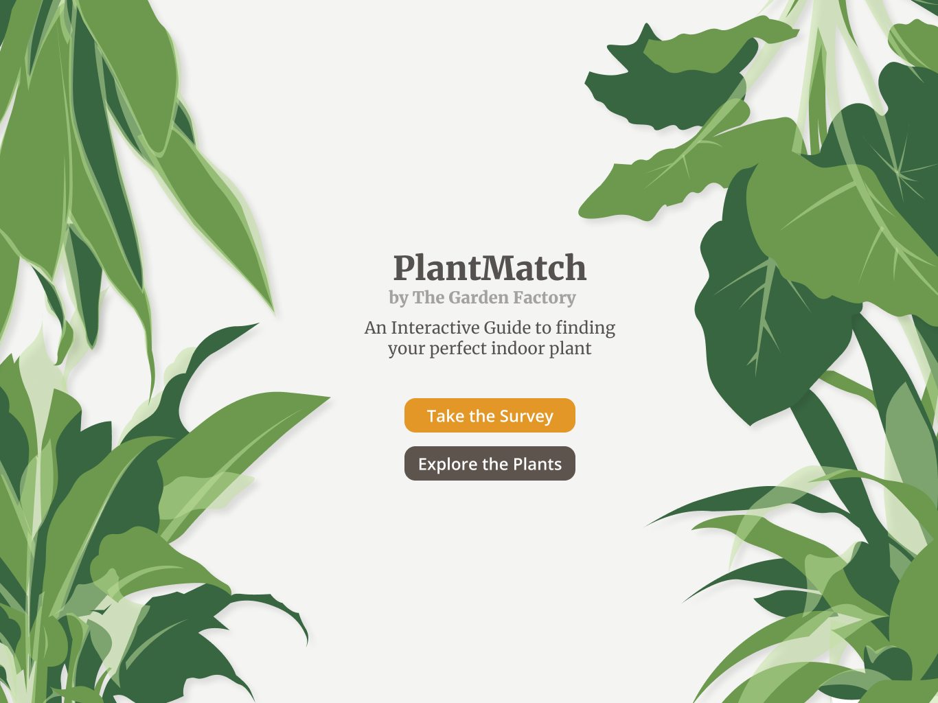
PlantMatch is an interactive kiosk in Rochester’s the Garden Factory. It allows users to explore plants that pique their interest and learn more about their care requirements.
USER PERSONAS

The Young Explorer
Children visiting the Garden Factory will be looking for something fun to keep engaged.

The Curious Browser
Browsers will have open minds, and may want to learn more about the care required for the plants being sold.

The Experienced Enthusiast
Plant enthusiasts will want to expand on their knowledge of indoor plants.
COMPARATIVE ANALYSIS
Comparison #1:
Animated Chart of 42 North American Butterflies
Through its faults and merits, this chart provides some insight into what should be prioritized for PlantMatch:
- Clear interaction ability
- Subtle animations
- Categorized information
Comparison #2:
NASA Rover: Build it Yourself
Through its faults and merits, this experience provides some insight into what should be prioritized for PlantMatch:
- Context
- Combined design and function
- Clear communication
CONTENT FLOW

KEY FEATURES
Survey
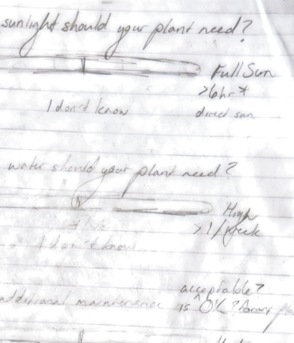
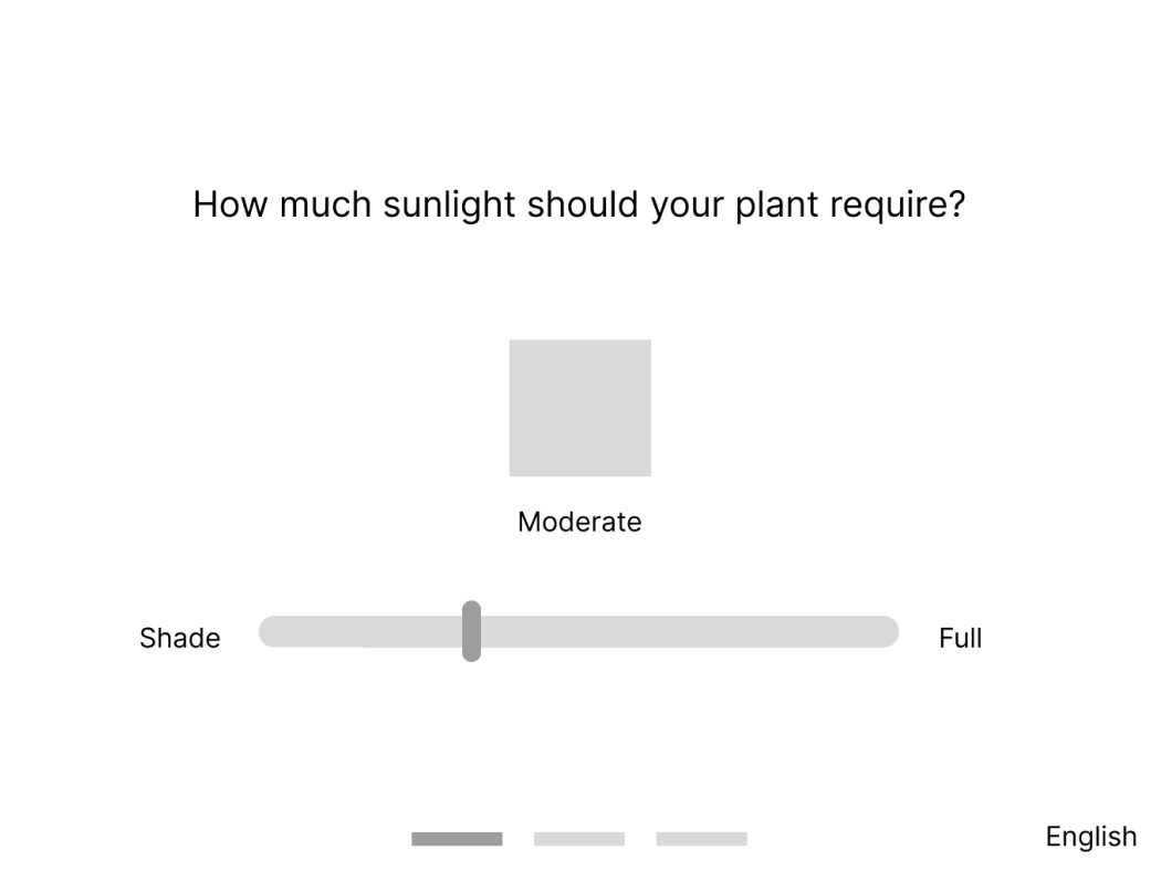
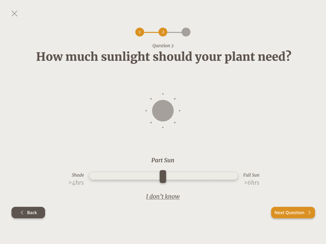
An optional survey provides the user with a fun, interactive way to narrow down their plant options.
CONCEPT SKETCHES
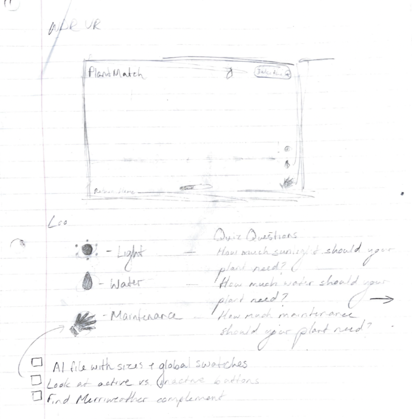
Filters
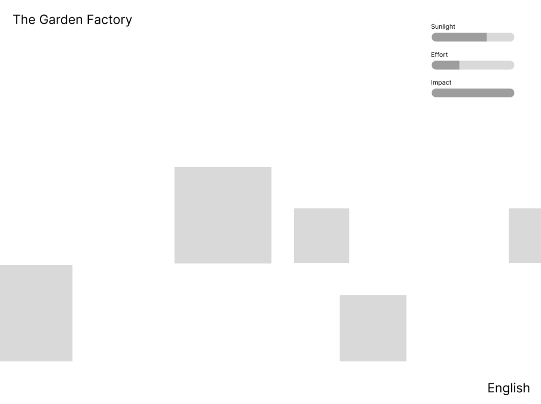
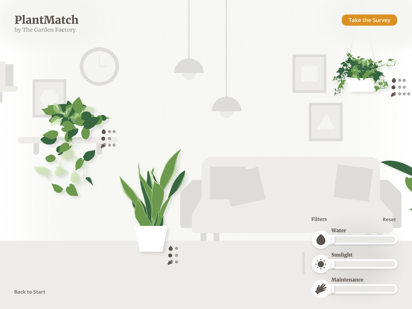
Specific filters relating to plant care let customers tailor their search to specific needs.
Interaction
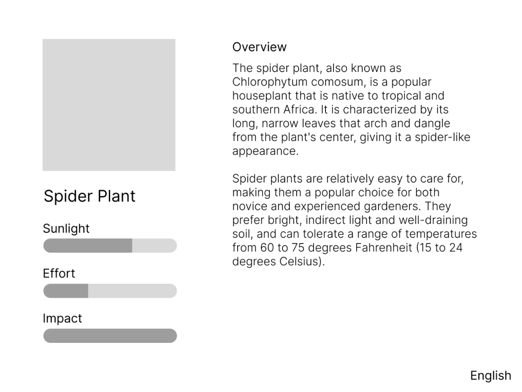
Users can tap on plants to learn more information about temperature requirements, pets, etc.
What factors do users actually care about?
FILTERS & ICONS
Water
Users will be able to filter plants based on how much water they require.
Light
Users will be able to filter plants based on how much sunlight they require.
Maintenance
Users will be able to filter plants based on how much maintenance they require.
DEVICE & GRID SYSTEM

iPad Pro 12.9"
1024 x 1366
The kiosk would be on a screen similar to the iPad Pro 12.9".

Baseline Grid 8px
8 Columns, 20px Gutter, 48px Margins
To keep screens consistent, a grid system was essential.
LOW FIDELITY WIREFRAMES
DESIGN INSPIRATION
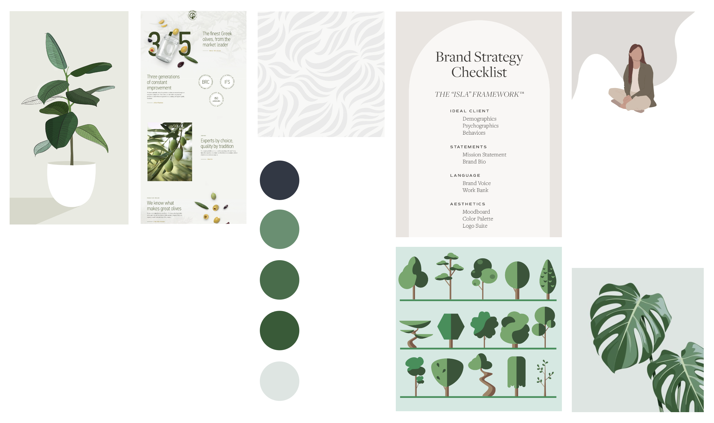
Vision Board
- Natural
- Minimalist
- Serene
- Contemporary
- Organic
ASSETS
Many Plants Were Brought to Life
All plants were created using reference images and Adobe Illustrator's pen tool. Twelve plants seemed like a good number to fill the room and to provide a variety of options for the user.












Organization Became Important
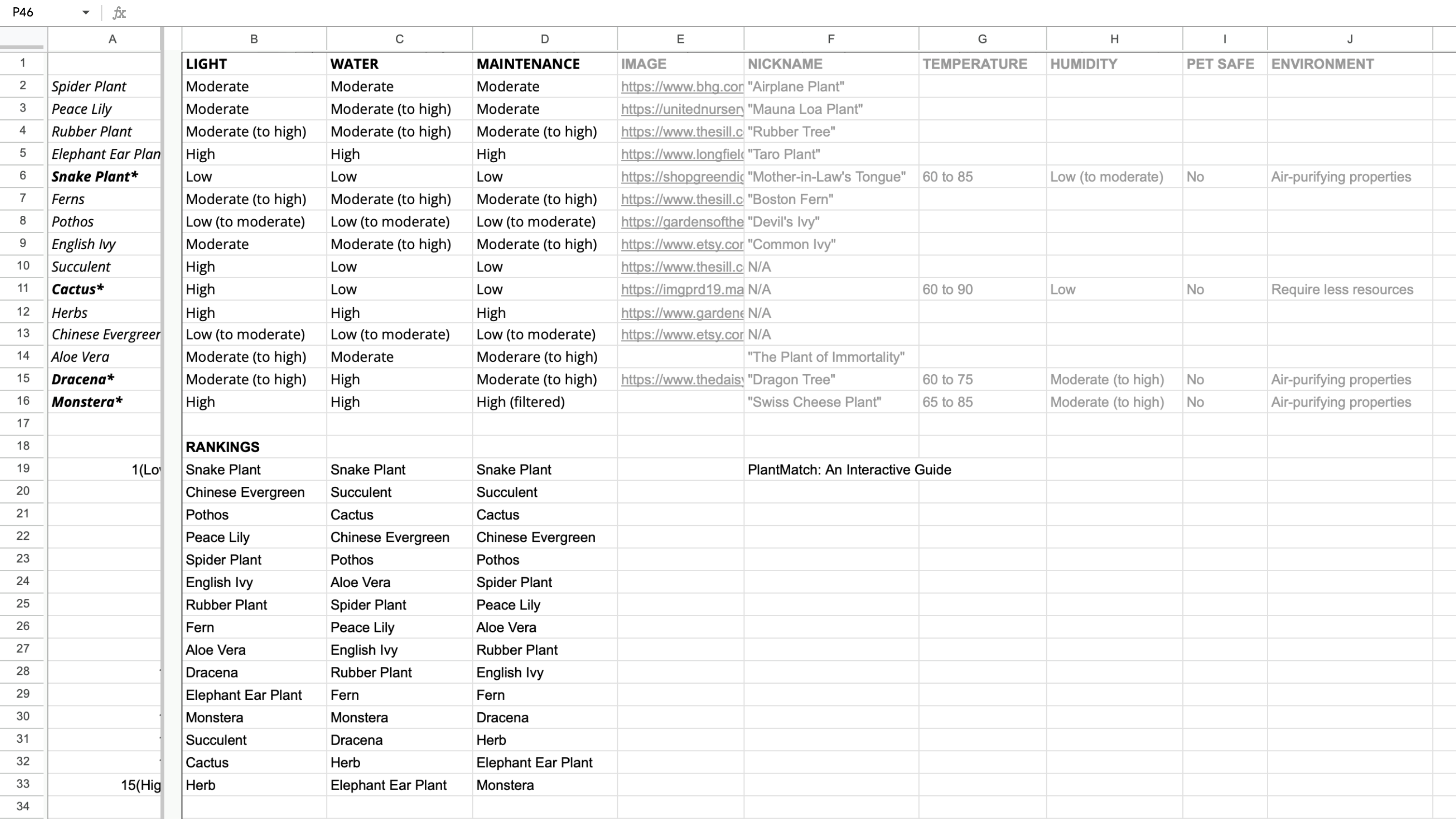
I created a spreadsheet to track all of the plants and their qualities.
INITIAL UI
First Iterations
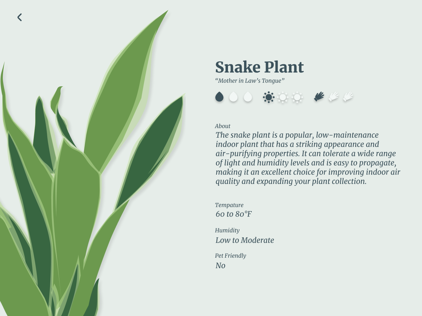
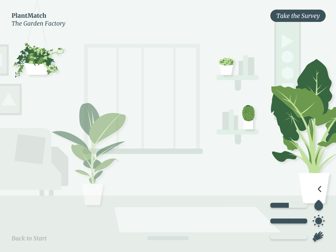
After some consideration, I decided that the initial screens lacked certain contrast and that it was time for a redesign.
CHANGES
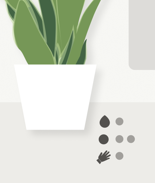
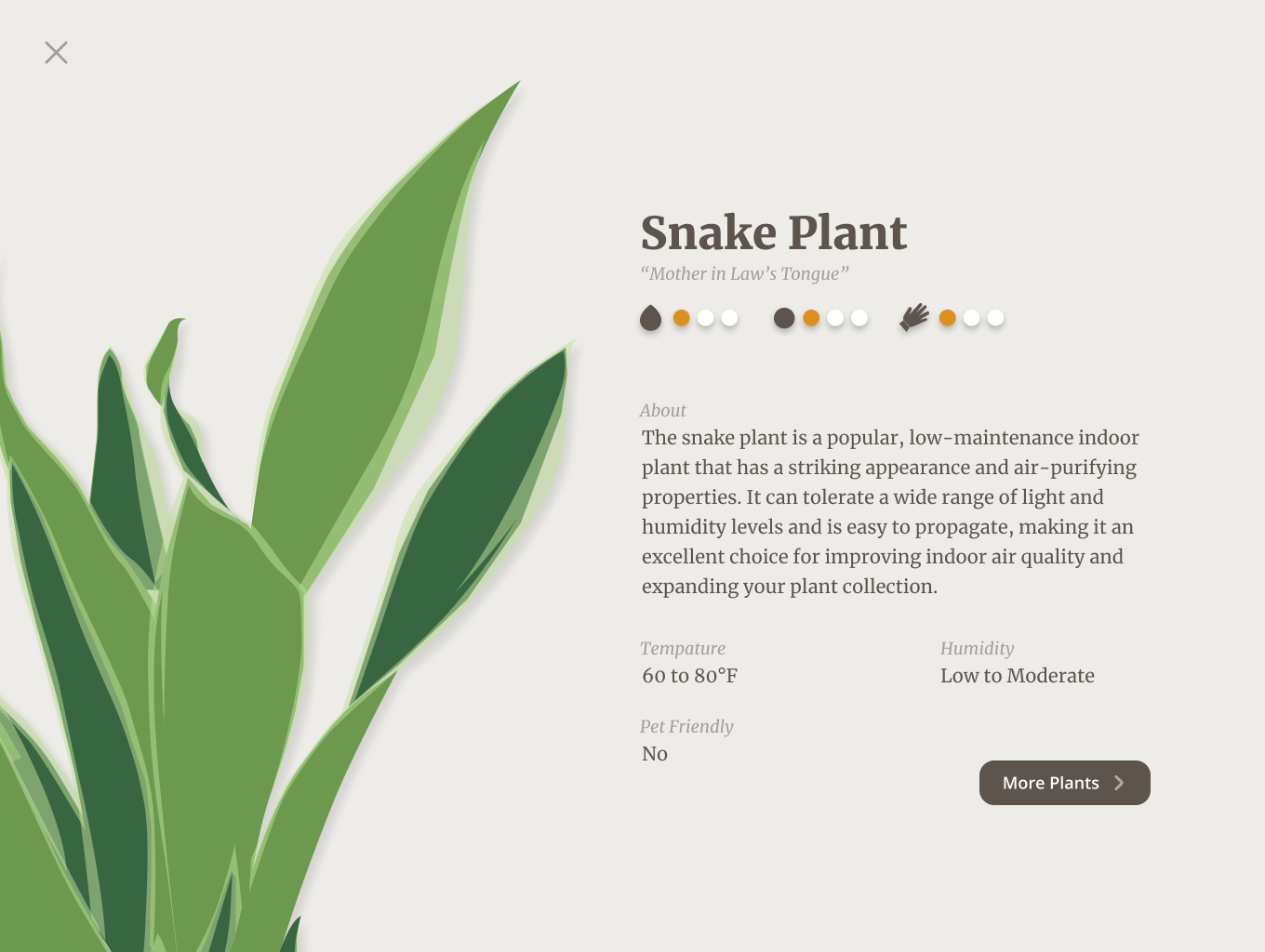
To provide the user more context, information about each plant was added to the main screen.
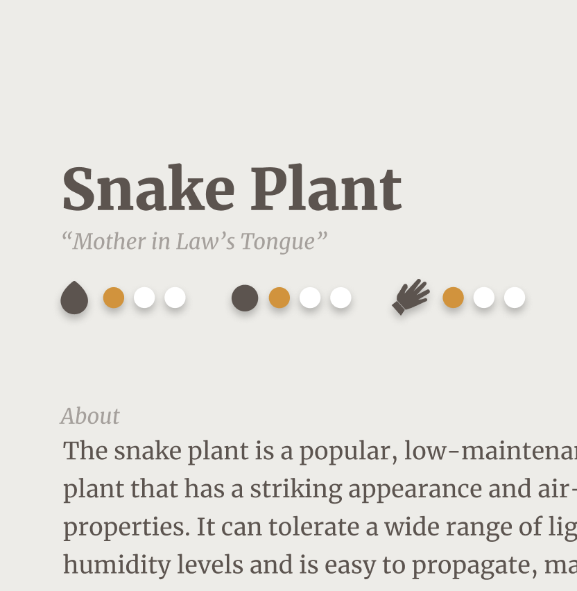
The previous ratings (three of the same icon next to each other) were replaced with circles to be less clunky.

A button was added to the description page to prompt the user back to the main screen.
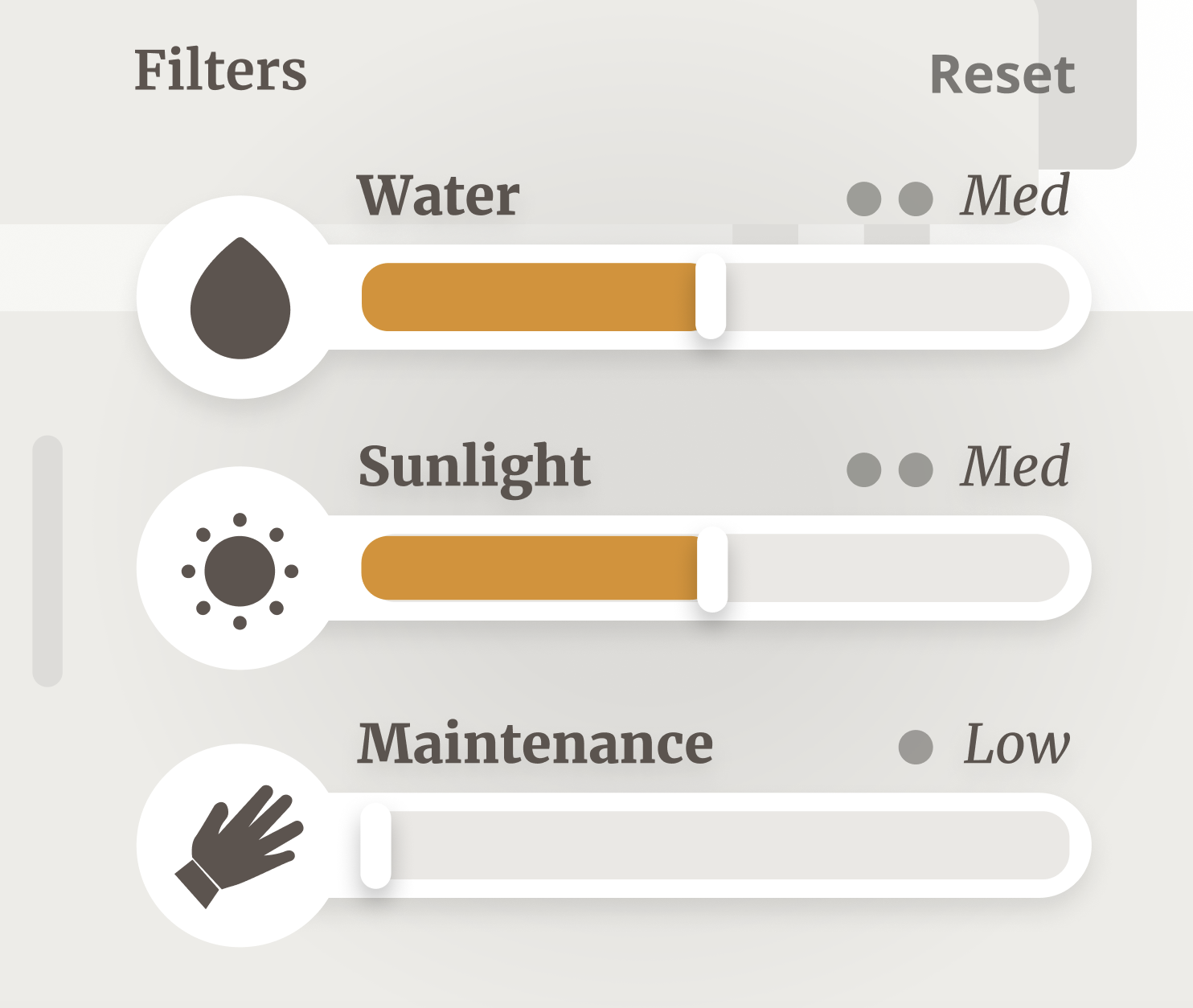
Significant features were added to the filter system to provide more context and to appear interactive.
FINAL UI
After Lots of Trial and Error,
SOLUTION
Final Prototype
IN THE END
Takeaways
- Trust the Design Process
- Work Smarter not Harder
Selected Works
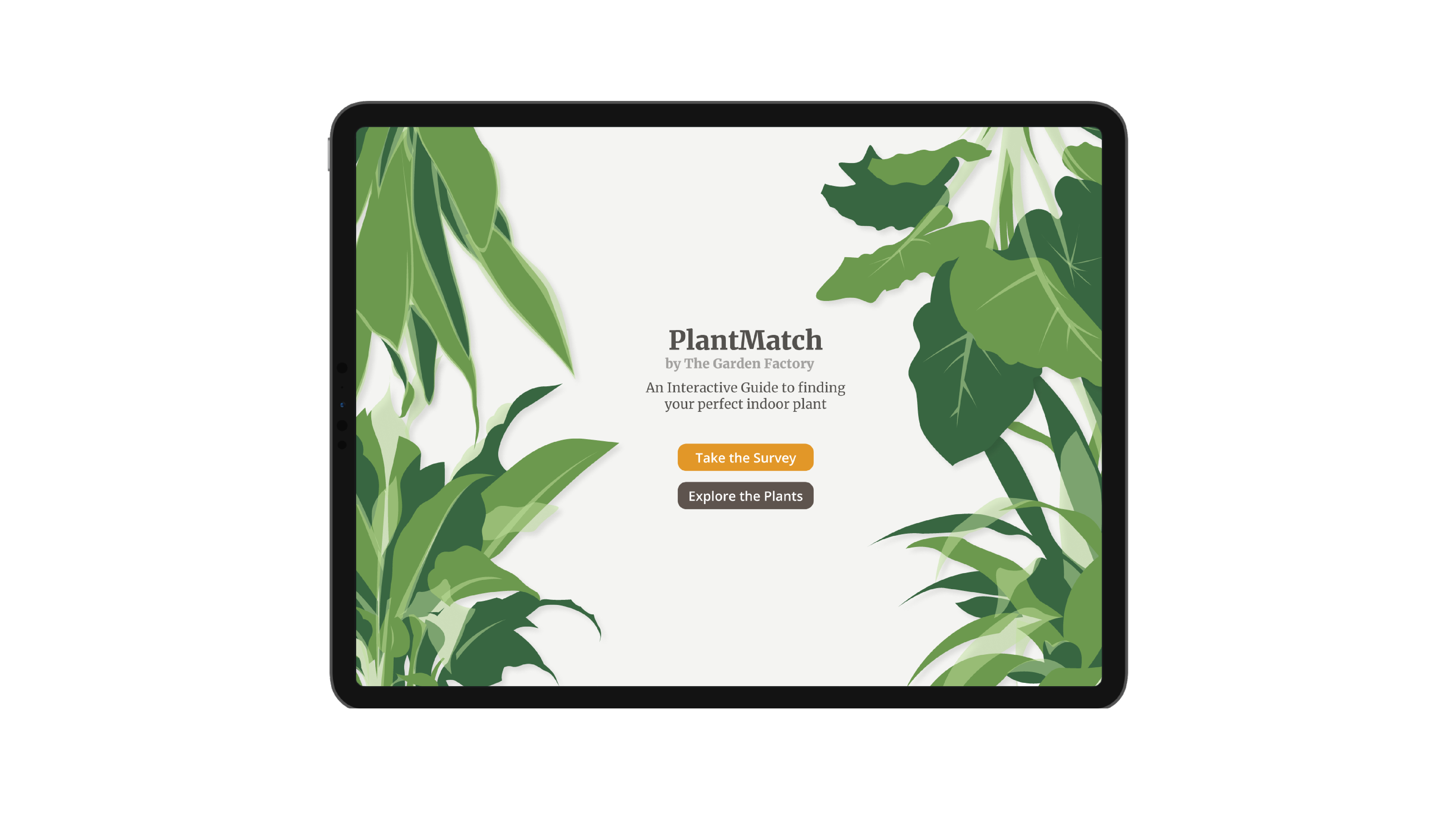
Plant Lovers' Favorite Gardening ToolResearch, Graphics, UI, UX
Defense Against Drunk DrivingResearch, Graphics, UI, UX
NYS ID ReimaginedResearch, UI, UX
New Light to a Boring TownComparative Analysis, UI, UX