A streamlined airline booking experience designed for an African airline, guiding users seamlessly from flight selection to checkout with clarity and efficiency.
Duration
10 Weeks
Key Skills
Information Architecture, Prototyping, Error Management, Design Systems
00 - Motivation
Air travel should feel exciting and easy from the very first interaction.
A well-designed booking experience should evoke a sense of anticipation and confidence, rather than frustration or confusion.
01 - Problem
Many airline booking websites feel outdated and overwhelming, making it difficult for users to complete their reservations with confidence.
02 - Brief
Design a web application for a multi-city air transportation service connecting three to four cities. Develop a functional prototype enabling users to effortlessly book trips between these cities. Prioritize error prevention, user guidance, and clear display of all associated fees.
03 - Significance
This project reimagines the airline booking experience by blending modern usability with symbolic design, making air travel feel seamless, intuitive, and culturally resonant from start to finish.
Main Features
04 - Solution Overview
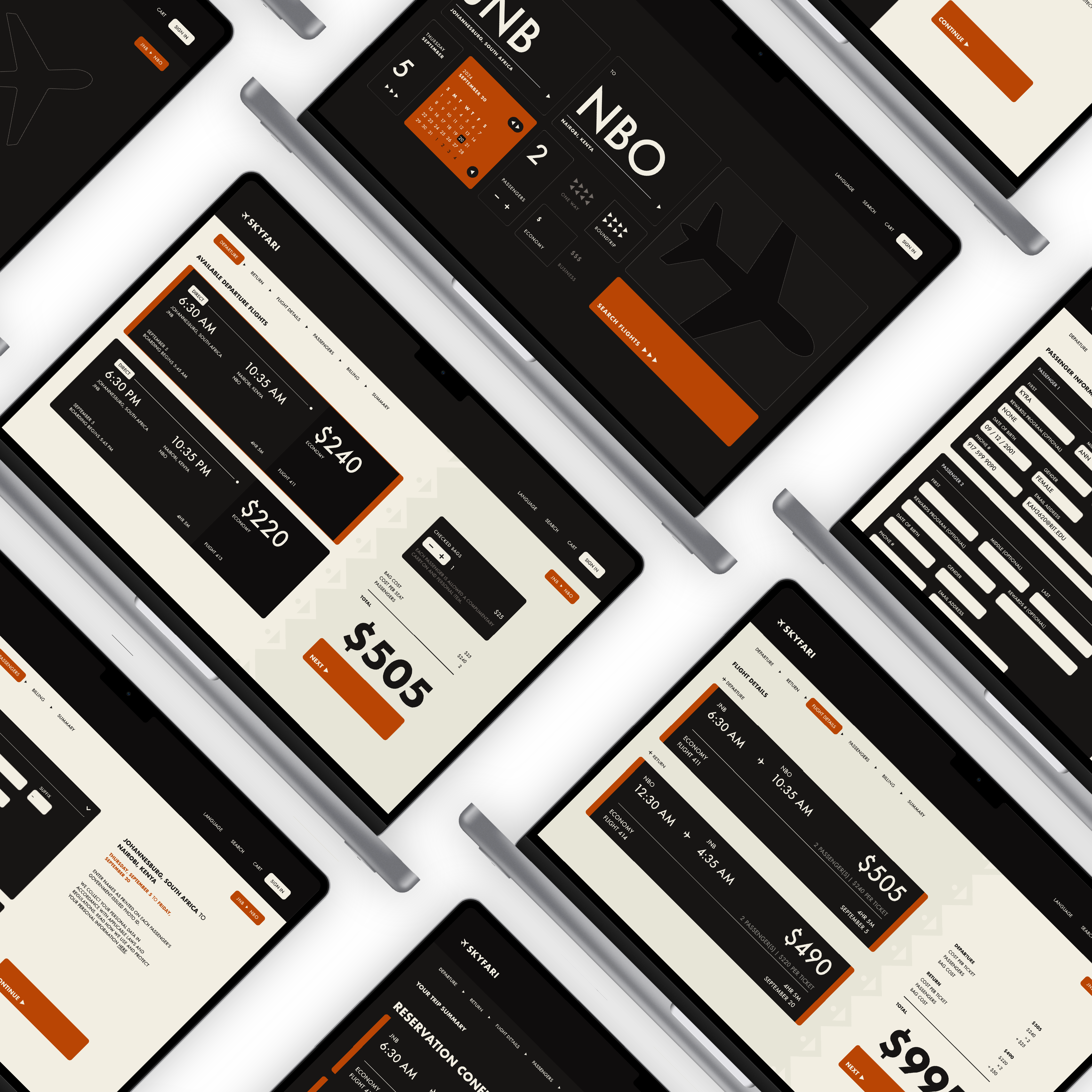
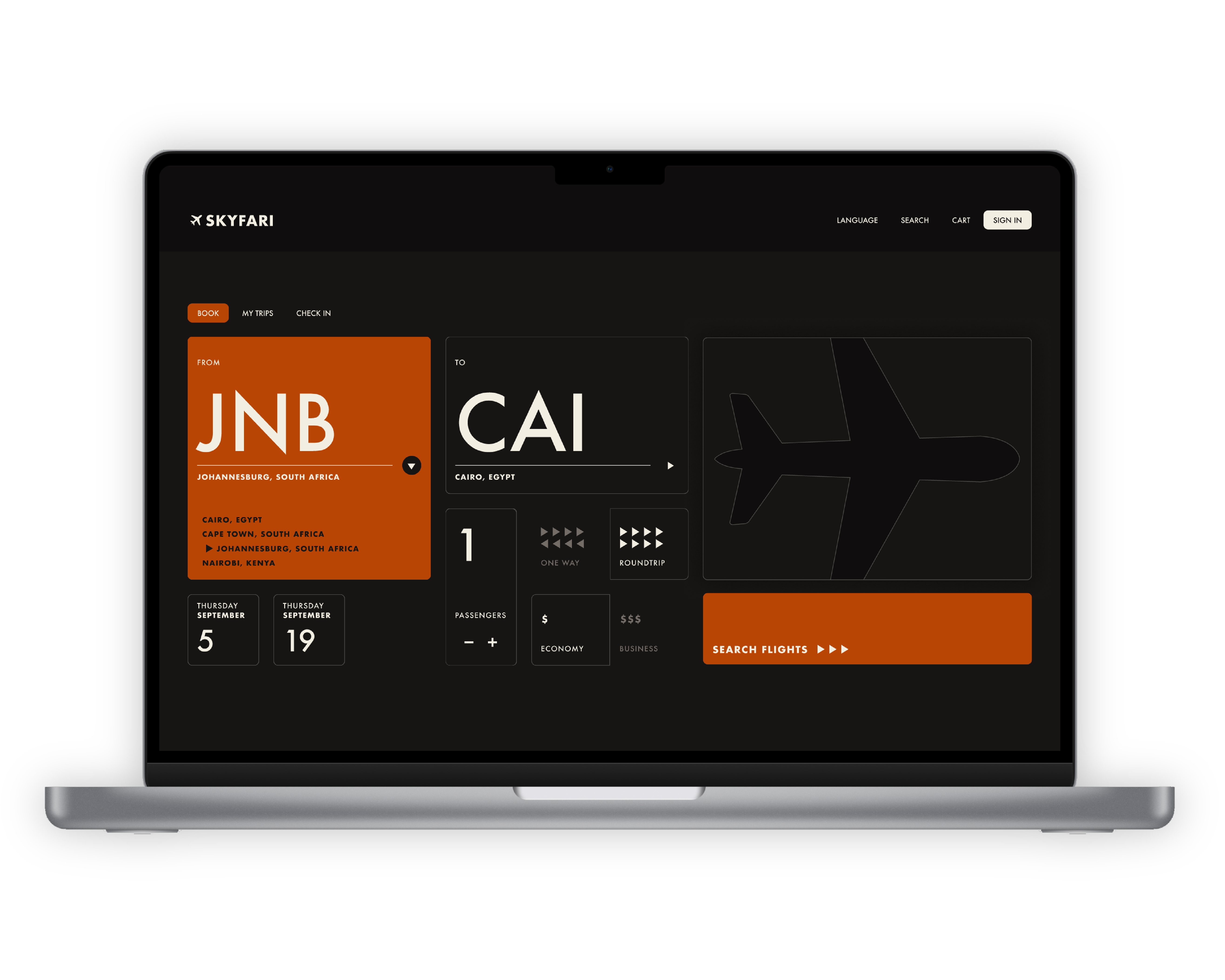
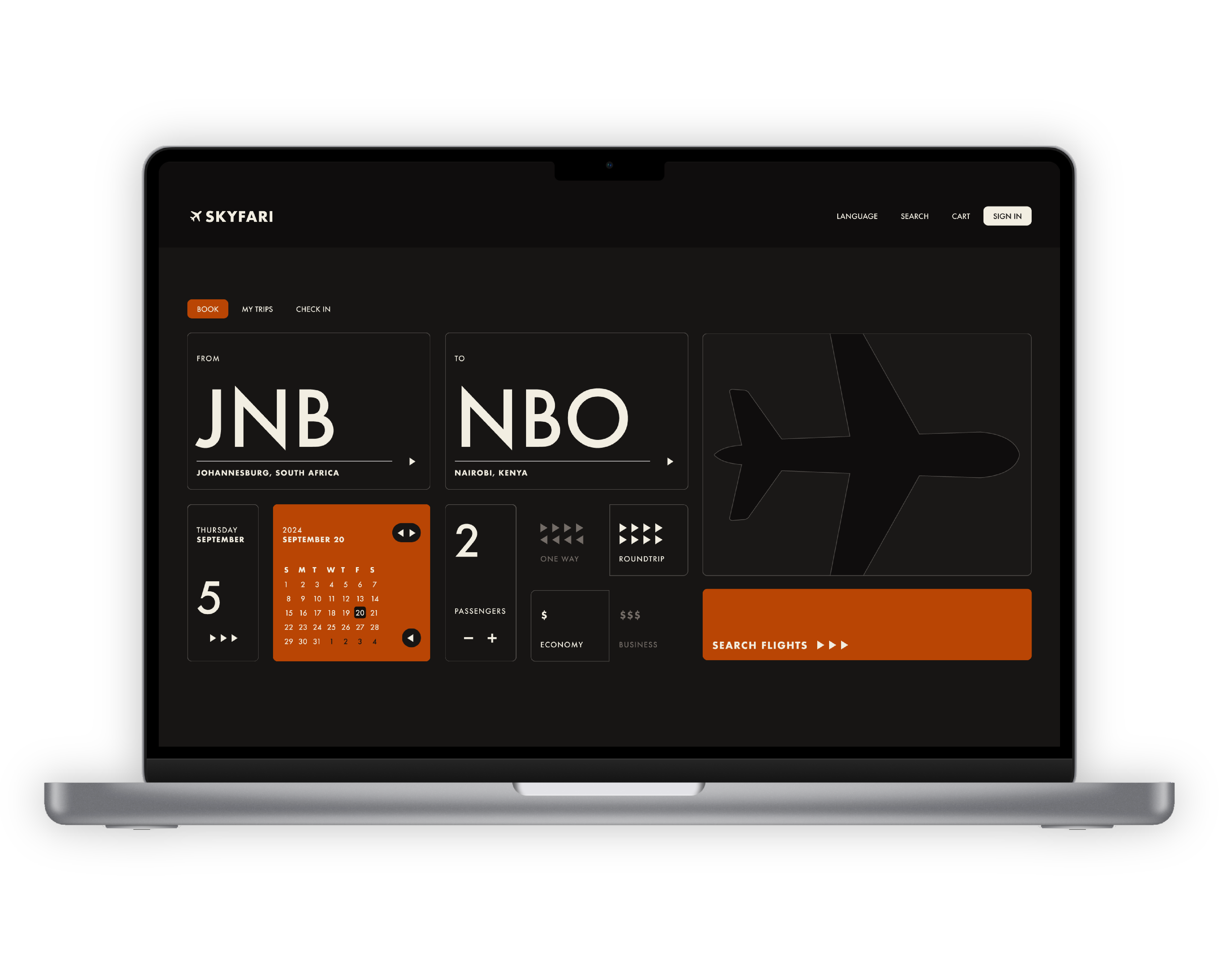
Stylized Homepage
Navigate a bento-style homepage that visually organizes key booking options. Each section highlights a different filter, allowing users to easily and fully customize their flight search.
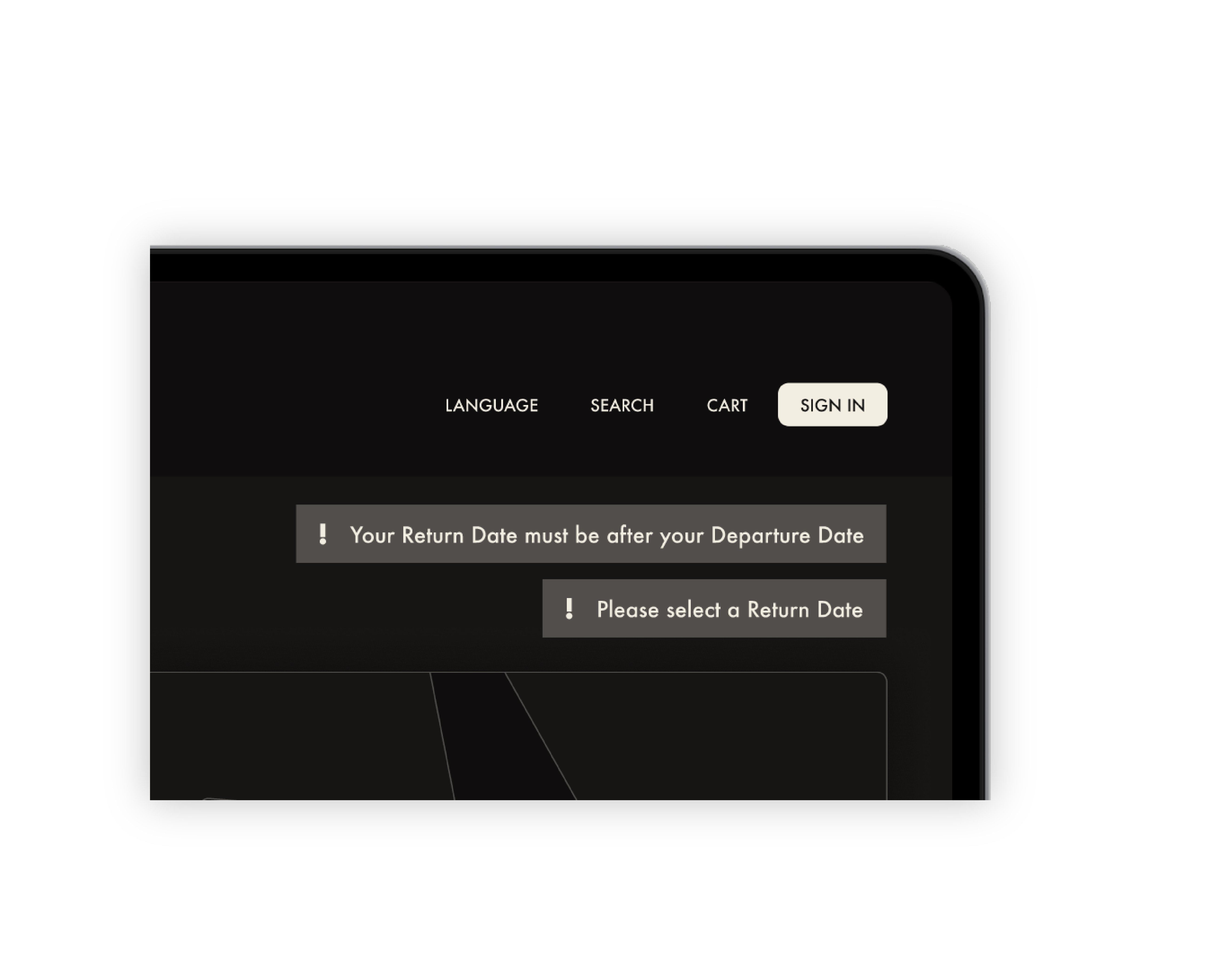
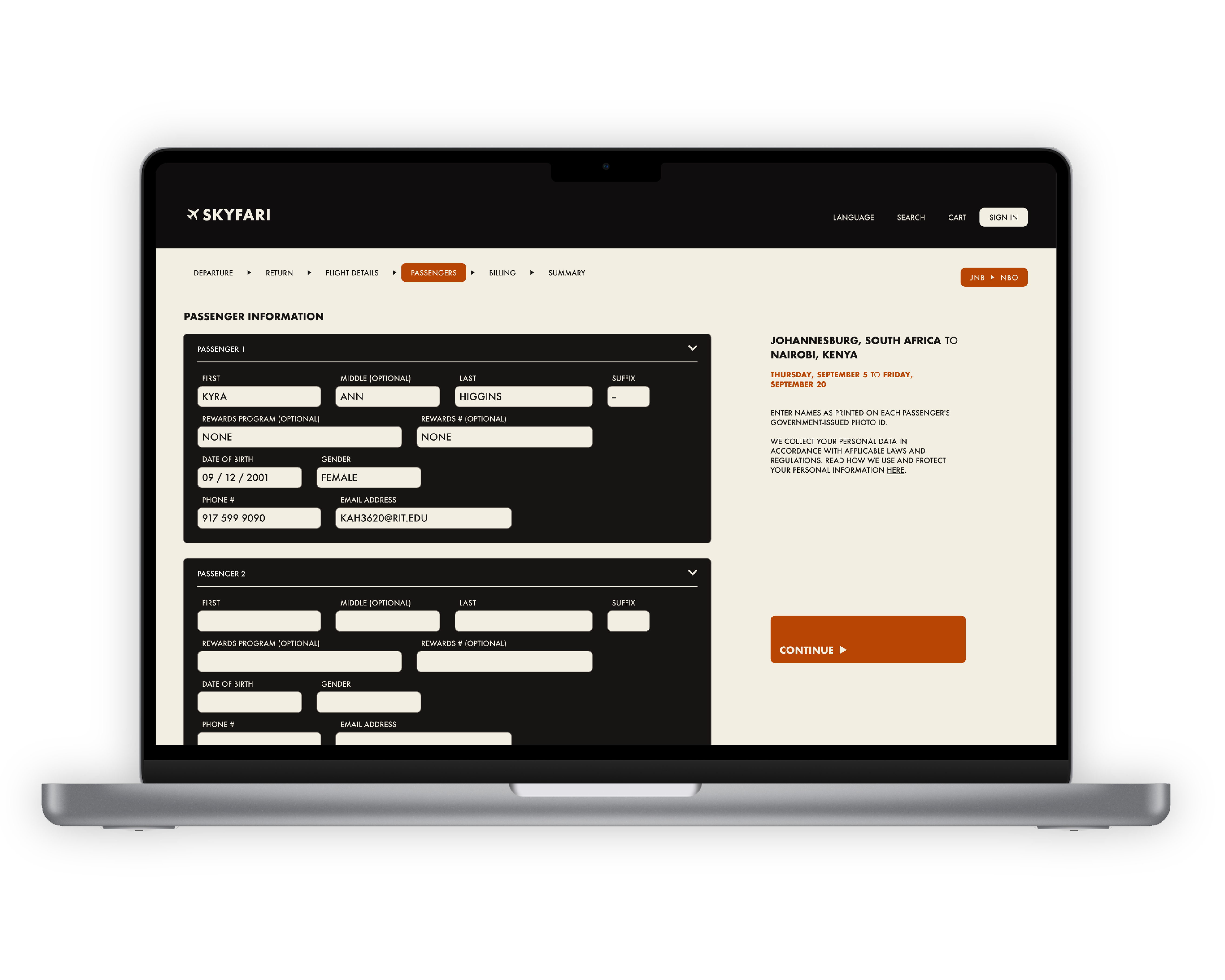
Error Handling
The website guides users with clear, friendly error messages throughout the booking process.
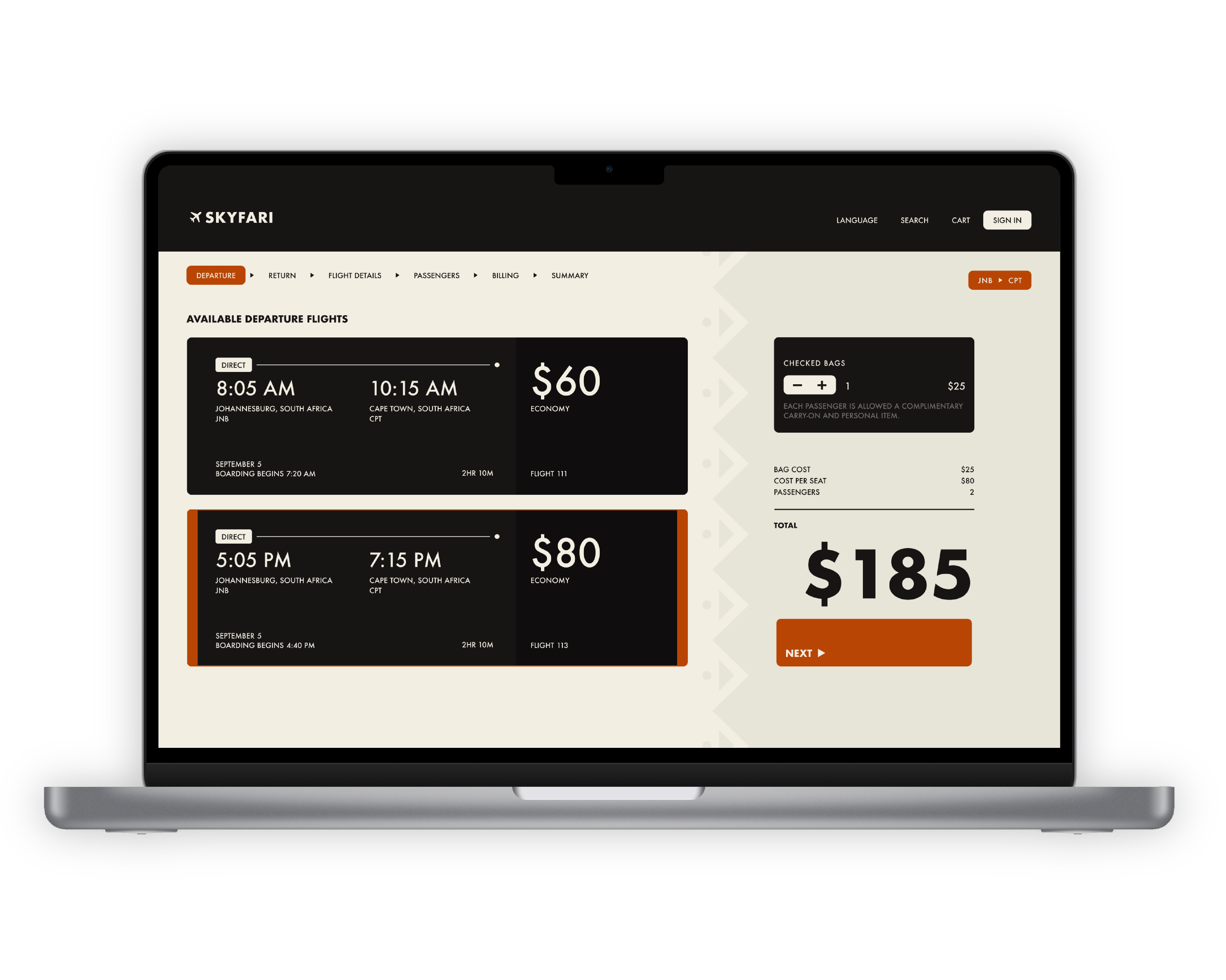
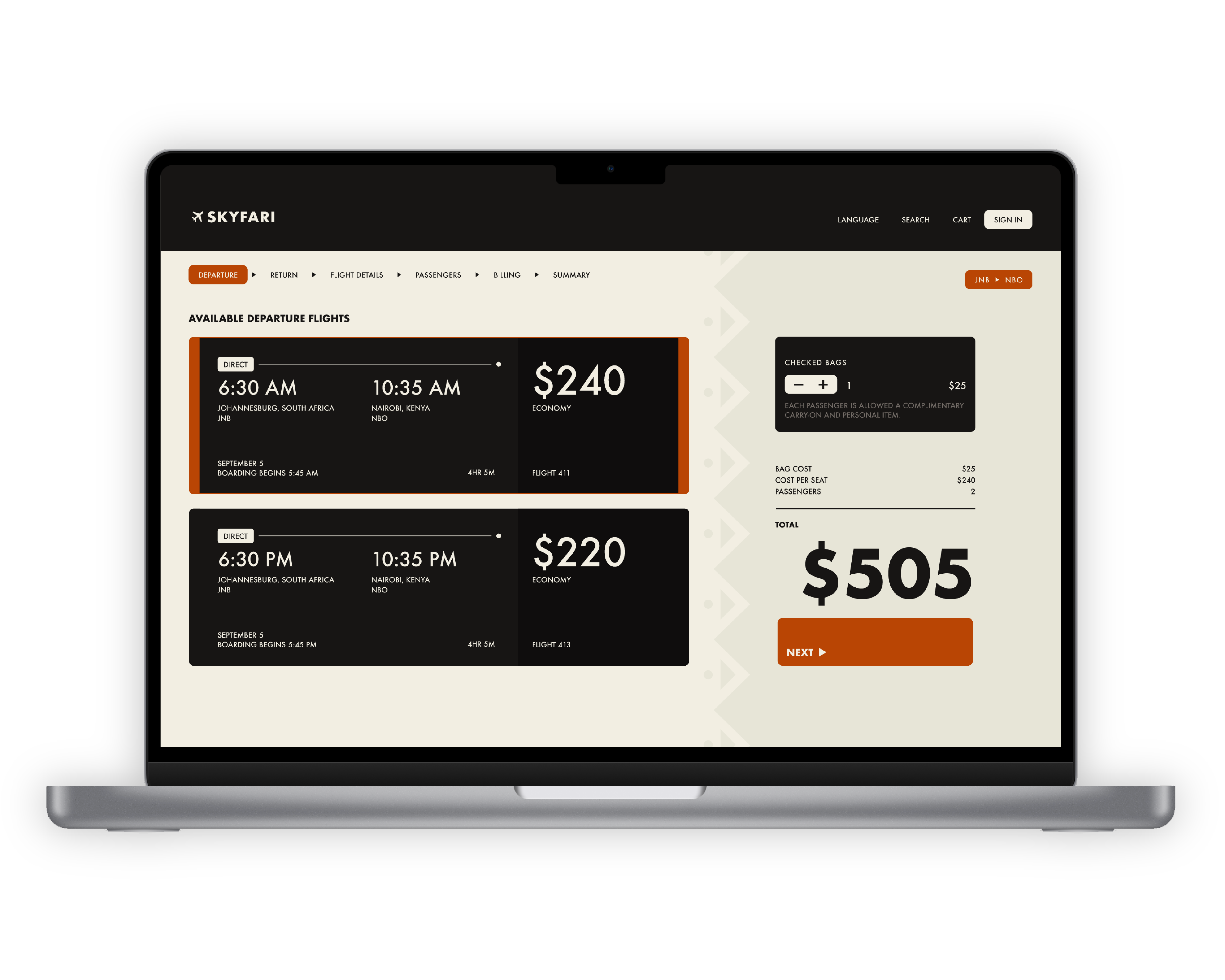
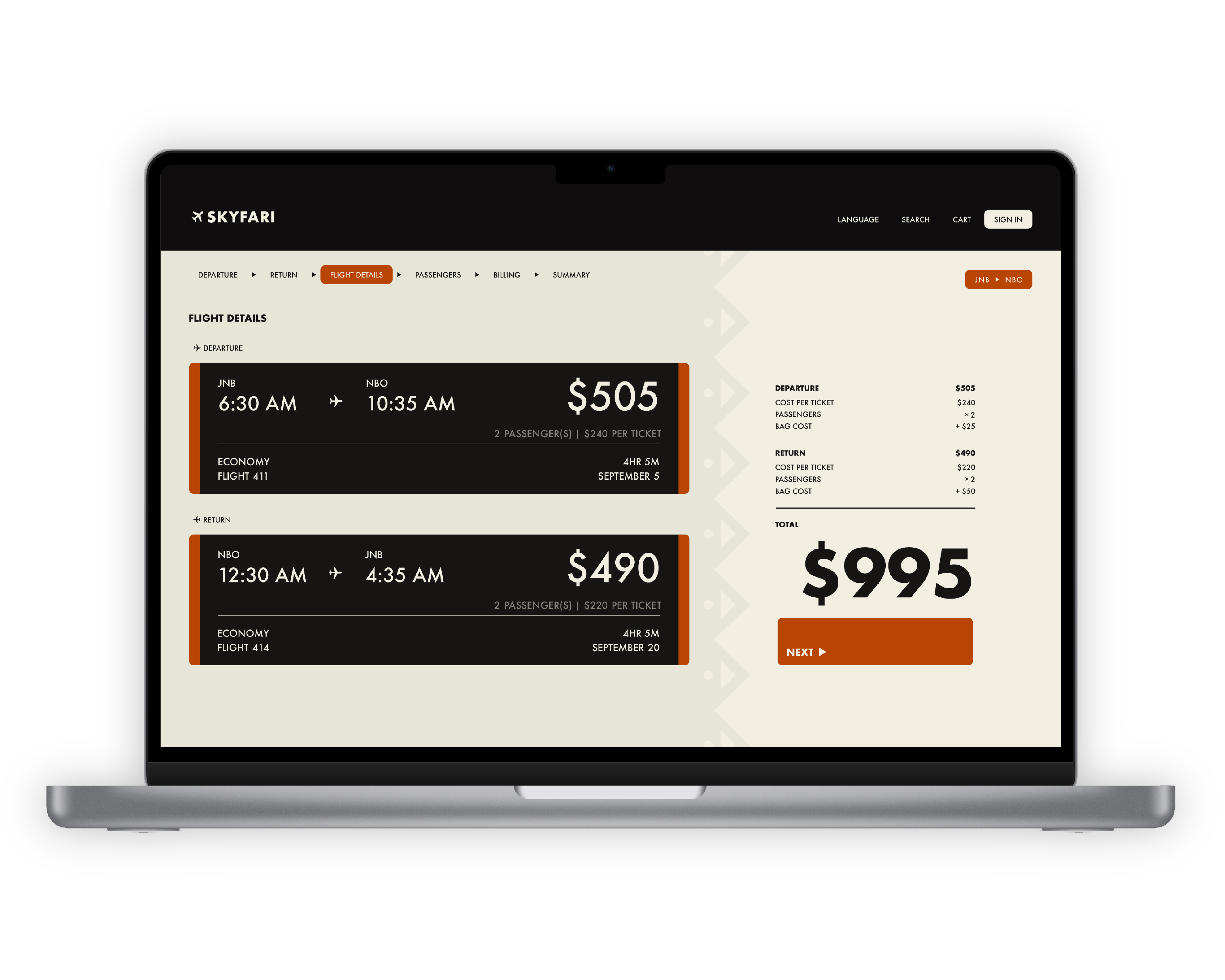
Ticket Selection
Select tickets effortlessly with a clear, structured layout. Easily compare options and proceed with confidence.
Research
05 - Survey
There’s a lot to consider in designing an airline website. I wanted my design to be intentional, so I broke down the airline’s structure and began to research. Some of my findings:
Four of the most travelled cities in Africa include:
Johannesburg (JNB), Cape Town (CPT), Cairo (CAI), and Nairobi (NBO)
In African design, the color black commonly symbolizes:
Strength, Unity, and Resilience
Two symbols that have been used in African design for centuries are:
Patterns and Fractals
With this information in mind, it was easier to visualize what I wanted my airline’s brand and website to look like.
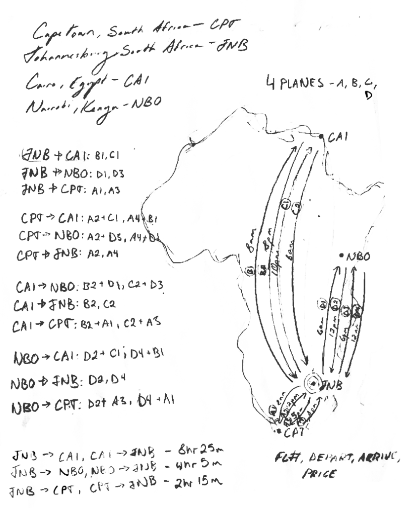
06 - Content
Before working on its design, I first mapped out the airline’s structure—its fleet, destinations, and key user flows—to ensure the information was organized intuitively and efficiently.
I chose JNB as a hub because of its popularity and comparitively central location.
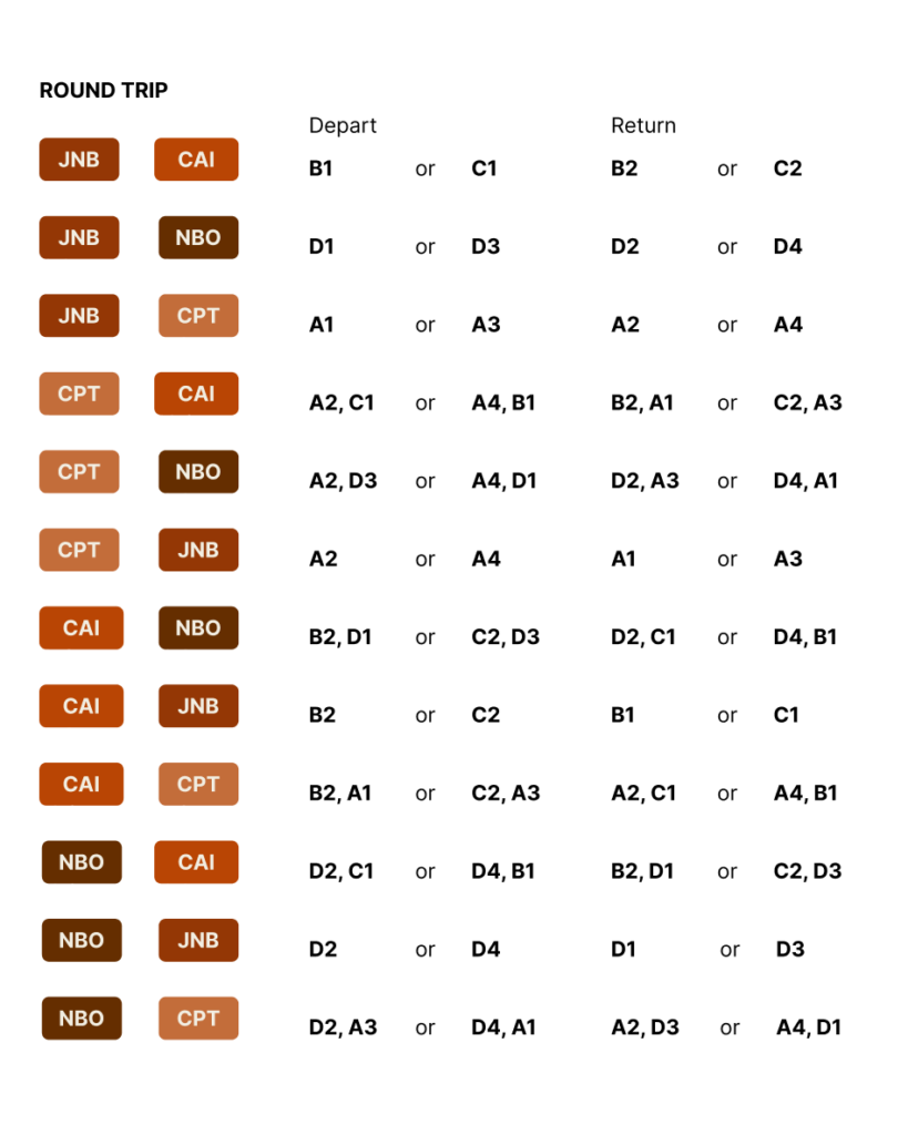
I kept the scope limited to roundtrips between four airports. Each trip has two flight options.
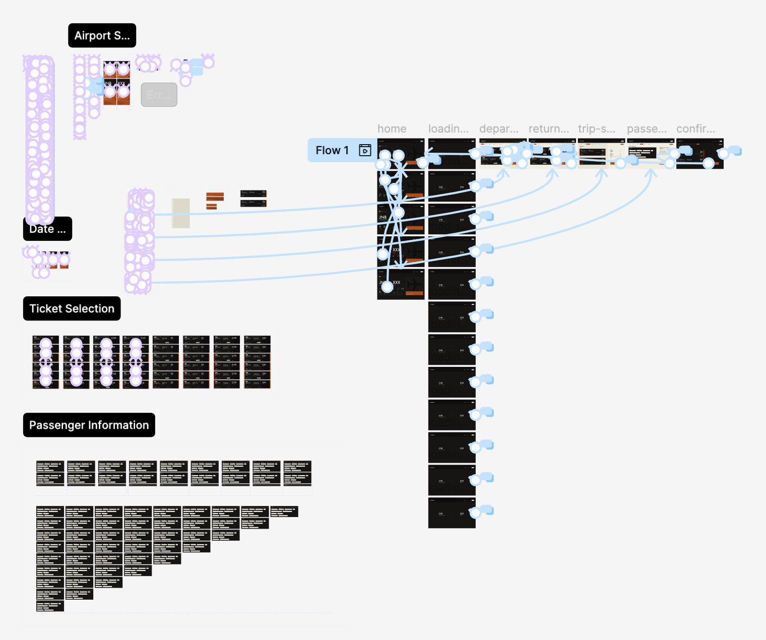
07 - User Flow
I mapped out the user flow from trip search to final confirmation. Each step is designed to provide an intuitive flow that follows the universal standards set by major airlines.
Trip Search
Departure Ticket Selection
Arrival Ticket Selection
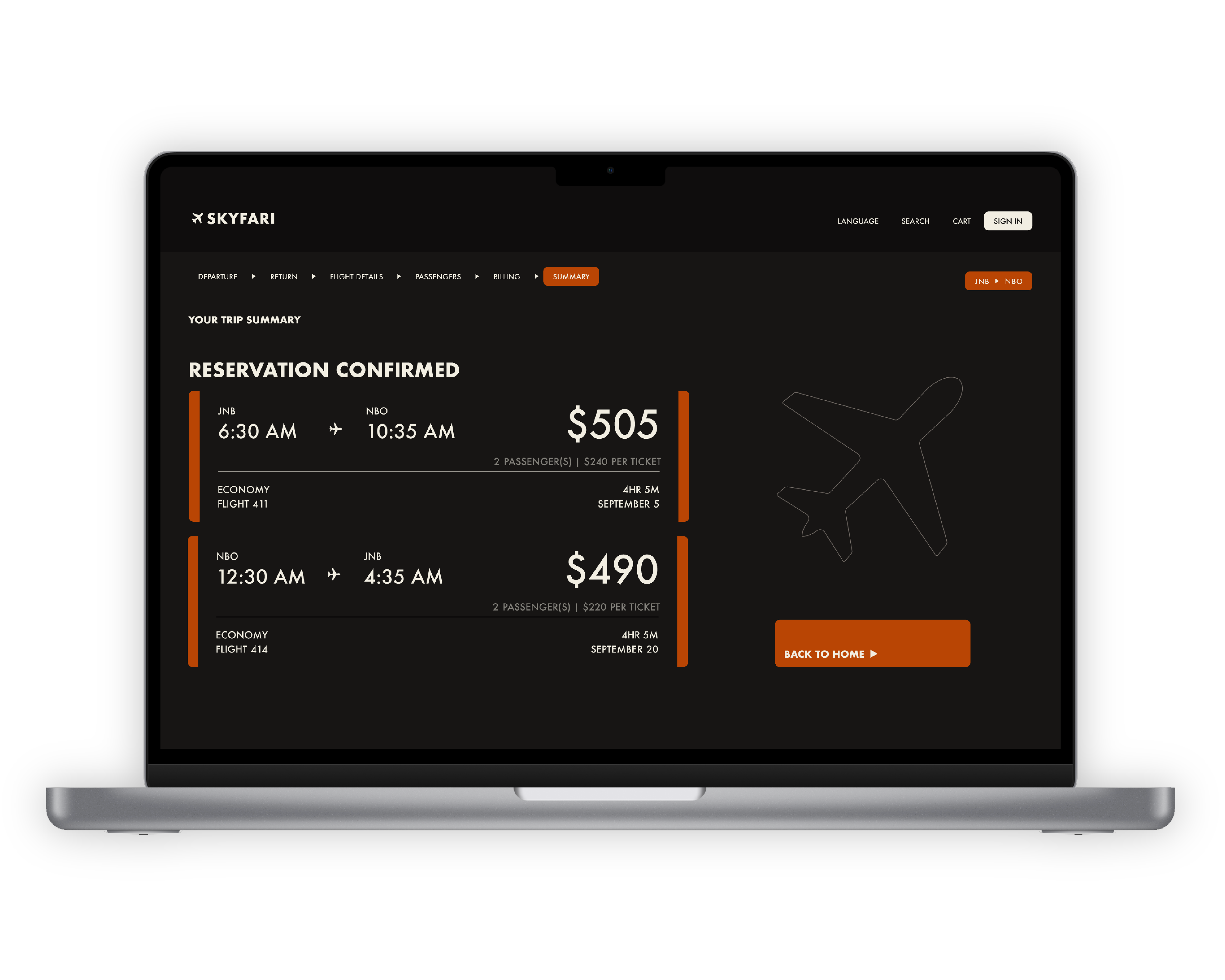
Trip Confirmation
Passenger Details
Trip Summary
08 - Informed Goals
Balance Identity with Industry Standards
To create an experience that feels distinct while still maintaining familiarity through universal booking conventions.
Visually Engaging & Structured Layout
To present key booking options in an organized yet visually dynamic way, ensuring clarity without overwhelming the user.
Clear Information Hierarchy & Accessibility
To prioritize essential flight details, pricing, and ticket selection in a logical flow while maintaining readability, accessibility, and effective error handling.
09 - Information Organization
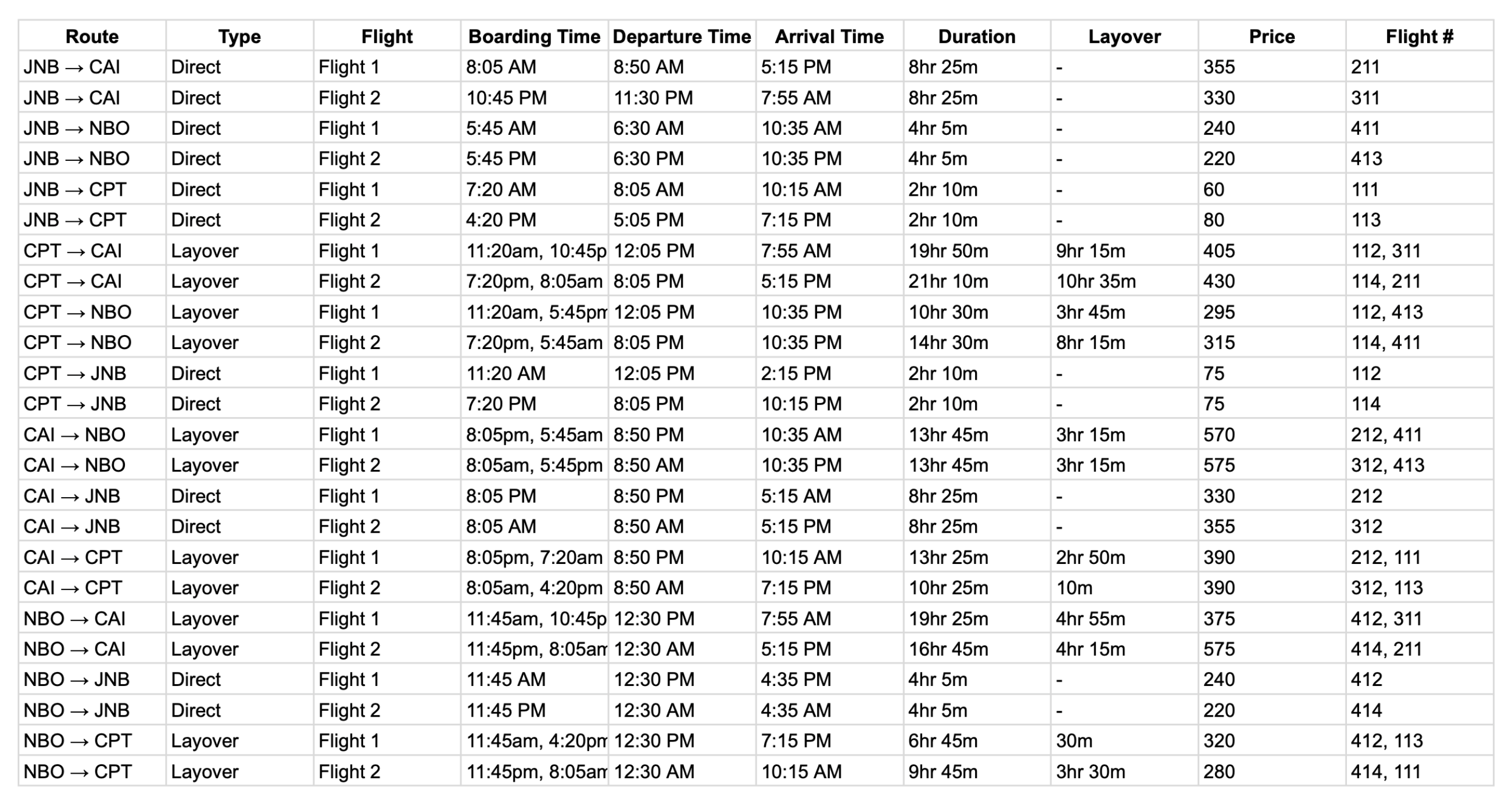
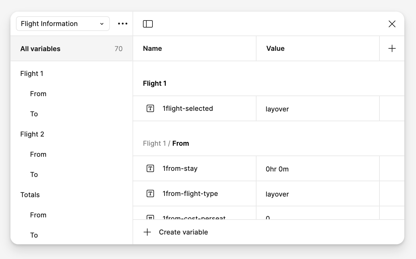
Before I started on the design, I needed to determine which flight information to display. A comparative analysis narrowed it down to eight items: type (layover or direct), boarding time, departure time, arrival time, total duration, layover duration, price, and flight number.
In order to make the website easier to prototype with variables, I mapped out each possible trip combination and its corresponding flight information.
10 - Style
To create a visually engaging and organized environment, I aimed to blend traditional African design patterns with the modern structure of a Bento grid.
Interface
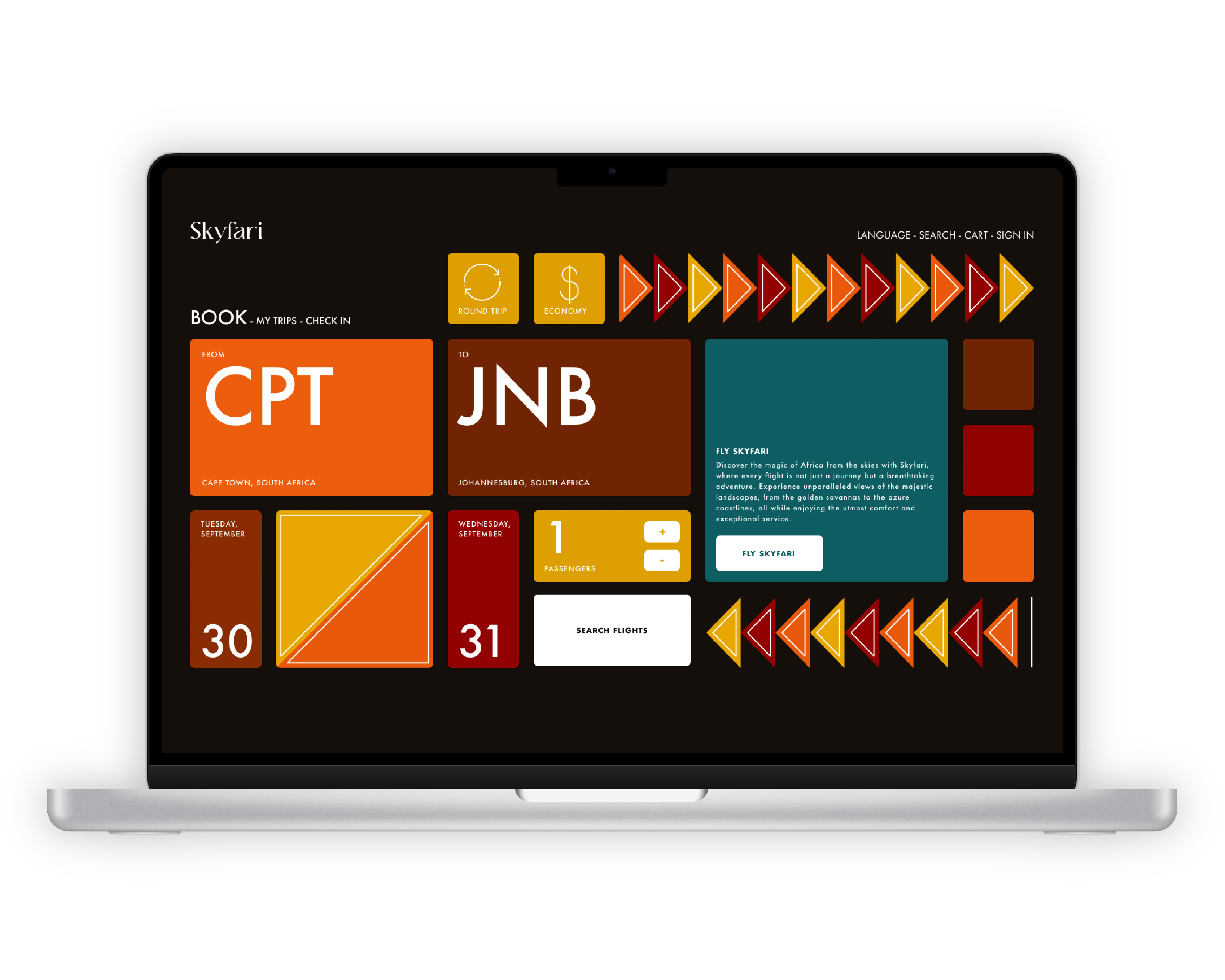
11 - First Iteration
In working on my first iteration, I focused primarily on creating a unique, inviting airline identity.
However, there were a few problems with it. After some consideration, here were my thoughts:
Hierarchy Issues
While the Bento layout is visually striking, some elements compete for attention rather than contributing to a clear user flow.
Decorative Elements
The repeating arrow patterns, while great for visual identity, may distract from functional elements.
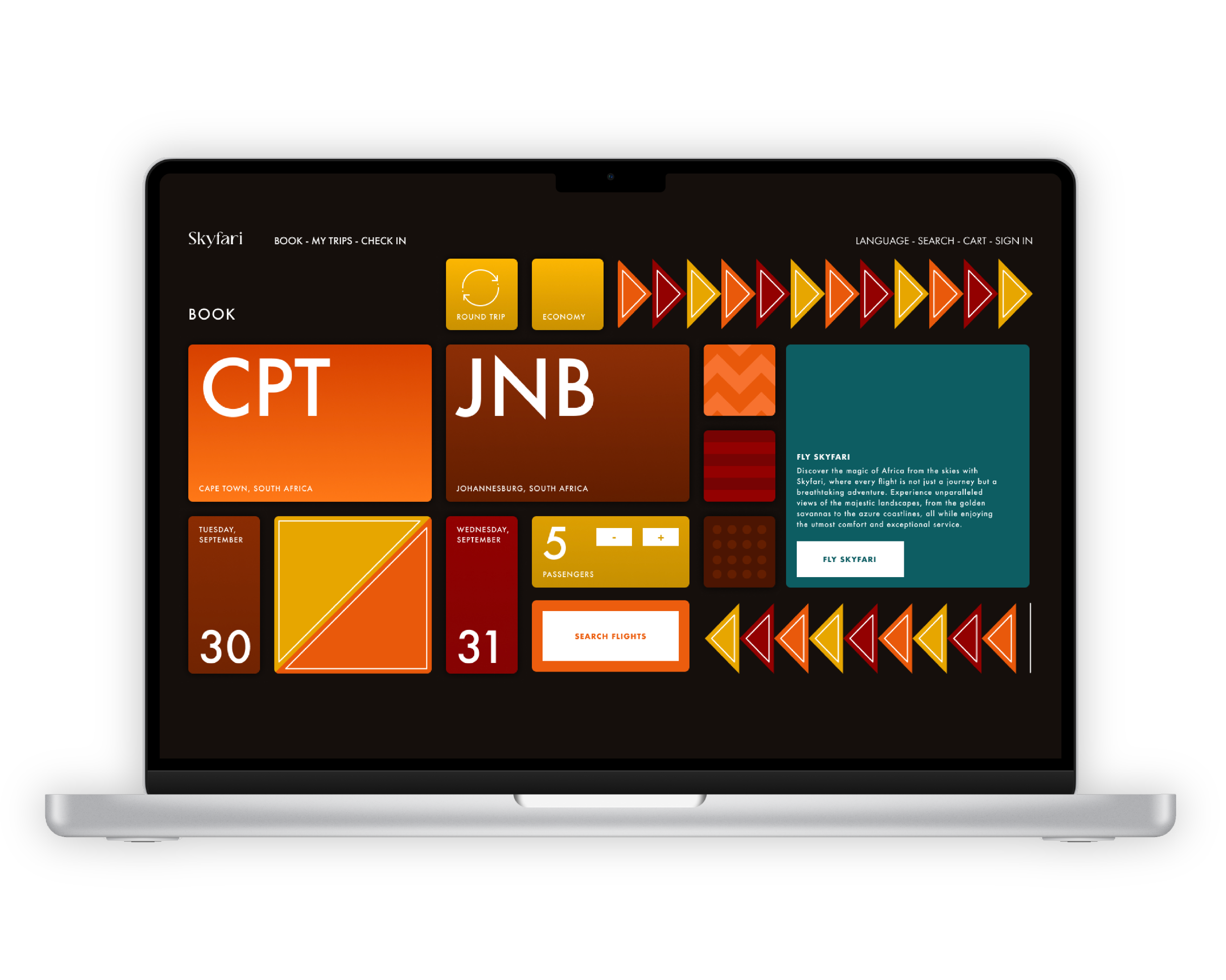
12 - Second Iteration
For my second iteration, I went with a muted yet distinct style. I also removed any unnecessary decorative elements, but there were still problems:
Interactivity Indicators
Although the layout is cleaner, some buttons (like round trip, economy, and passenger selection) don’t clearly look clickable.
Button Emphasis
The “Search Flights” button is a little underwhelming. Its appearance as a large, mostly empty section makes it easy to overlook.
Interactivity
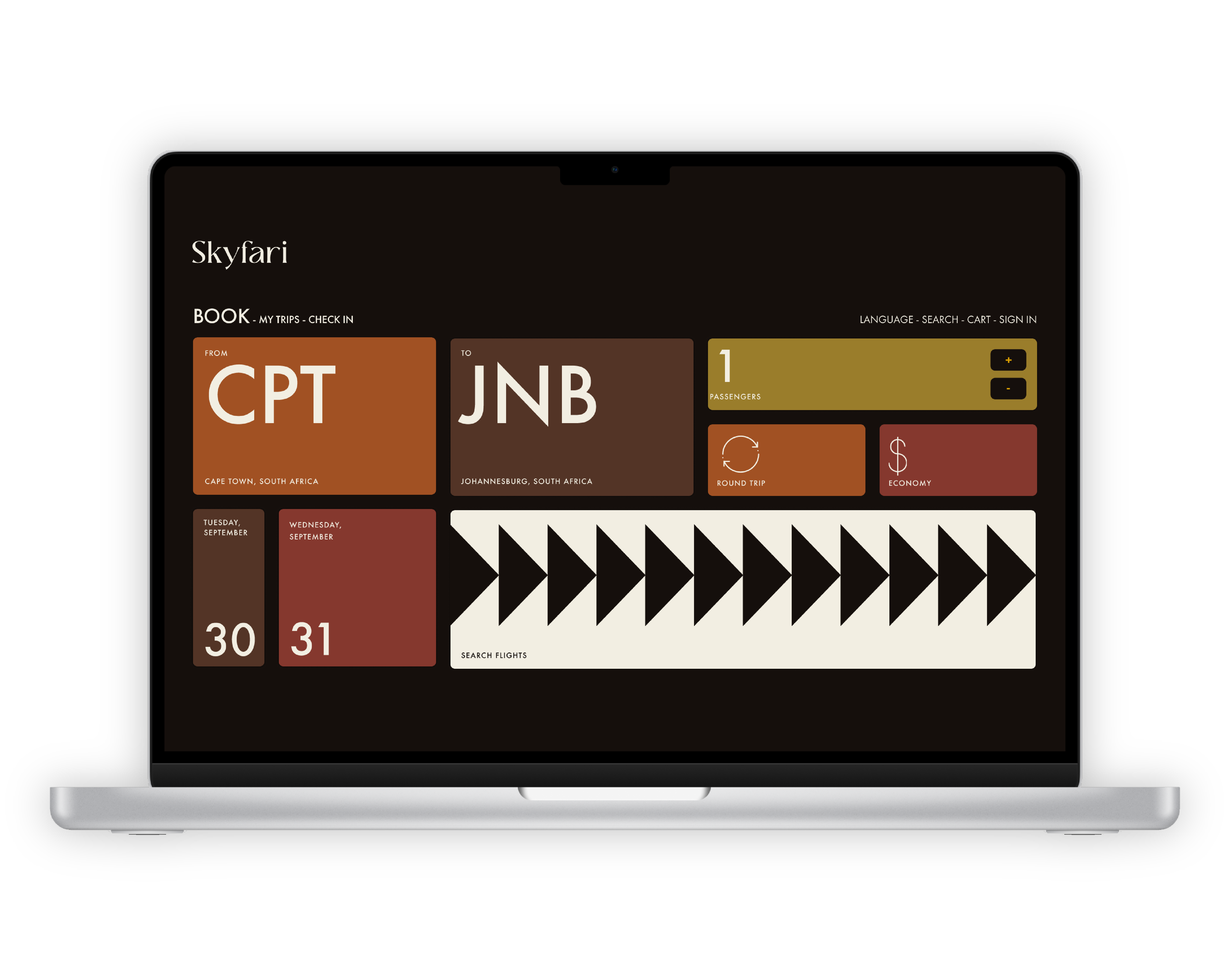
13 - Comprehensive Prototype
Using Figma’s component, variant, and variable features, I created a fully functional version of the booking process.
Final
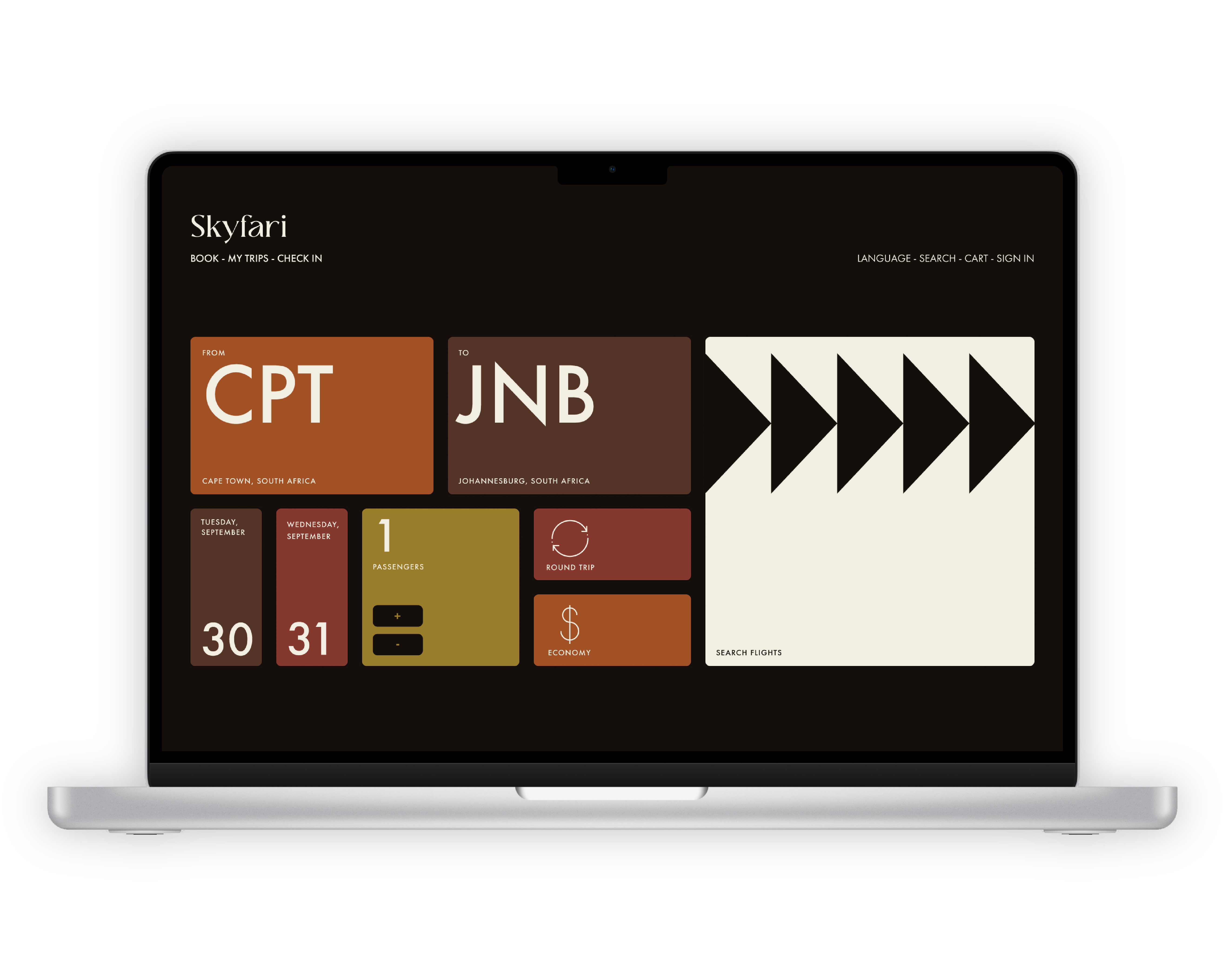
14 - Final Iteration
For the final solution, I improved a lot upon my initial prototype:
Clear Interactive Cues
Through the use of intuitive icons, additional buttons, and subtle contrast, interactive elements appear definitively clickable. Error management identifies the limitations of each input field.
Distinct & Efficient Layout
Spacing, alignment, and subtle contrast guide users naturally through the flow. The most important actions stand out, while supporting elements sit back, still acessible.
Cohesive & Meaningful Design
The design is polished and intentional, with a balanced color palette, sharp typography, and refined iconography. The use of space and contrast enhances readability and usability.
15 - Final Solution
My final solution successfully balances a sleek, modern aesthetic with better usability and clearer interactions.
16 - Takeaways
Understand Content
When possible, understand the information and content you’re working with, and design with it in mind. Designing around content can create a more individual, catered experience.
Let Go
Your goals do not always align with the user’s. Every element should have intent, and most of the time, decoration is arbitrary.